gridviz
Gridviz API reference
Table of contents
- Gridviz API reference
- Table of contents
- Concepts
- Defining the map
- Adding data
- Filtering and formatting data
- Basic styles
- Advanced styles
- Side styles
- Esthetic styles
- Kernel smoothing
- Custom styles
- Background layer
- Foreground information
- Transparency
- Tooltip
- Buttons
- View scale
- Stretching
- Legends
- Leaflet
- Limit panning and zooming
- Mixed resolution grids
- Alright?
Anything unclear or missing? Feel free to ask !
Concepts
Here are few concepts on Gridviz to be aware of:
-
A gridviz map is composed of a stack of layers. Layers may have different types (background image, boundaries, labels, etc.). The main layer type is GridLayer, for gridded data. Background layers are usually drawn below, usually a single one. Boundaries and label layers should also be drawn as foreground, on top of grid layers.
-
Gridded datasets are defined independantly from their grid layer. Each gridded dataset may thus be reused by several layers: It is loaded and stored once, and reused several times. This reuse allows saving memory space and loading time.
-
A gridded dataset may be multi-resolution. Gridviz then takes care of selecting the most suitable resolution according to the visualisation zoom level (and a predefined minPixelsPerCell parameter). This ensures only the relevant data for the visualisation view and zoom level is loaded and displayed.
-
GridViz supports data tiling, and also Parquet format.
-
A grid layer draws a single gridded dataset using one or several styles. It is thus possible to combine styles and draw them on top of each other to show different aspects of the data.
-
A style specifies how to draw the cells within the view. The style is not defined at cell level only - it allows defining more advanced styling techniques using cell sets, based on the relations of each cell with its neigbours.
-
Gridviz comes with a library of predefined styles. These styles are customisable. Users are also offered a full flexibility to define their own style and show their cells the way they need. Predefined style may be seen only as examples and inspiration sources.
-
Predefined styles parameters are usually not static values, but functions of usually four parameters: The cell to be drawn, its resolution, the zoom level, and a viewscale object. Styling parameters (such as colors, size, etc.) may thus be computed depending on each cell, its resolution, and the zoom level. Size parameters are usually specified in the unit of measurement of the grid coordinate reference system, usually ground meters. They may also be specified in screen pixels. These functions allow adapting the cartographic styles (colors, dimensions, etc.) to the cell values, their size and the zoom level.
-
For some predefined style parameters, viewscale parameter allows defining styling parameters based on the cells within the map view only. This parameter is an object computed only once from the cells within the view. It may be used for example to compute the minimum and maximum values of these cells and adapt a color scale to this for a better contrast. It should generally be used to compute scales that are view dependant - hence the name viewscale. See this section for some examples.
-
Gridviz zoom level, usually noted z, is defined in ground UoM per pixel. The ground UoM is usually meter. z value can be used directly to transorm distances from ground distance to map screen distance, in pixels, as a division. resolution parameter is the cell size, in ground UoM. Its size in map screen pixel is thus ‘resolution / z’.
-
A grid layer shows gridded data in the grid coordinate reference system. Several gridded datasets may be overlayed, as soon as they are defined in the same coordinate reference system. Other layers (background, labels, etc.) must be defined also in the grid coordinate reference system.
Defining the map
When building a gridviz map, in addition to the container element you can also specify an options object with the properties outlined in the table below.
For example:
new gridviz.Map(document.getElementById('map'), {
    x: 4500000,
    y: 2900000,
    z: 1000,
    legendContainer: document.getElementById('myLegendDiv'), // if you want your legend in an external container
    selectionRectangleColor: 'red', // cell hover
    selectionRectangleWidthPix: (resolution, z) => '1',
    backgroundColor: 'white',
    tooltip: {
        fontSize: '1.2em',
        transitionDuration: 100,
        maxWidth: '20em'
        fontSize:'1.2em'
        background :  'white'
        padding: '5px'
        border :'0px'
        'border-radius' : '0px'
        'box-shadow' : '5px 5px 5px grey'
        'font-family' :'Helvetica, Arial, sans-serif'
        transitionDuration : 100
        xOffset:  30
        yOffset:  20
        yMouseOffset : 0
        xMouseOffset : 0
        parentElement : document.body
    },
    onZoomStartFun: (event) => {
        console.log('pan/zoom start', event)
    },
    onZoomFun: (event) => {
        console.log('zoom', event)
    },
    onZoomEndFun: (event) => {
        console.log('pan/zoom end', event)
    },
})
| Property | Type | Default | Description |
|---|---|---|---|
| opts.legendDivId | string | ‘gvizLegend’ | The identifier of the element upon which the legend will be appended. |
| opts.selectionRectangleColor | string | ‘red’ | The colour of the outline when a cell is highlighted. |
| opts.selectionRectangleWidthPix | Function | (r,z) => 4 | A function specifying the thickness in pixels of the outline when a cell is highlighted. The function parameter r is the cell resolution. z is the zoom level. |
| opts.transparentbackground | boolean | false | Whether the background should be filled with colour (backgroundColor) or not. It is essentially the difference between using context.fillRect vs context.clearRect. |
| opts.backgroundColor | string | ‘white’ | The background color of the canvas when transparentBackground is set to false. |
| opts.disableZoom | Boolean | false | Disables d3 pan and zoom when set to true. |
| opts.onZoomStartFun | Function | null | Event handler for when a pan/zoom event is initiated. |
| opts.onZoomFun | Function | null | Event handler for when a pan/zoom event is occurring. |
| opts.onZoomEndFun | Function | null | Event handler for when a pan/zoom event has finished. |
| opts.tooltip | Object | undefined | See tooltip |
Adding data
A gridviz dataset defines how to retrieve gridded data, as a list of grid cells. A grid cell is stored as a javascript object having a x and y property, which is usually the coordinates of the grid cell lower left corner in the grid coordinate reference system. The x and y values are usually multiples of the grid resolution value.
Gridviz proposed several types of datasets: Javascript, CSV, Parquet.
These datasets may be bundled into multi-resolution datasets, to be used for multi-scale maps:
Gridviz can also show tiled data. This ensures only the data within the viewshed are loaded and displayed. These tiled data should follow the tiled grid format.
- See this example for tiled CSV data (code).
- See this example for both tiled and multiscale CSV data (code).
For Parquet data support, see the gridviz-parquet extension.
For better efficiency, it is recommended to use multi-resolution tiled parquet data.
Layers
There are a few different types of layers that can be added to a gridviz map: Once you have constructed them, simply add them to the map like so:
map.layers = [yourLayer] // they will be drawn in order
GridLayer
new gridviz.GridLayer(dataset, [style], {
    minPixelsPerCell: 12, //optional
})
BackgroundLayer
const backgroundLayer = new gridviz.BackgroundLayer({
    url: 'https://raw.githubusercontent.com/jgaffuri/mbxyz/main/pub/elevation_shading/',
    resolutions: Array.from({ length: 9 }, (_, i) => 28.00132289714475 * Math.pow(2, 10 - i)),
    origin: [0, 6000000],
    filterColor: (z) => '#ffffff77',
})
BackgroundLayerImage
const backgroundLayer = new gridviz.BackgroundLayerImage({
    //the image URL
    url: 'https://raw.githubusercontent.com/jgaffuri/mbxyz/main/pub/img/reunion_relief_100k.png',

    //the georeferencing information:
    // - geo coordinates of the top left corner
    // - the image width and heigth in geo unit (meters). It is the image width/heigth in pixel multiplied by the resolution (meters/pixel)
    xMin: 314686,
    yMax: 7691260,
    width: 64590.2,
    height: 57178.2,
})
BackgroundLayerWMS
const backgroundLayer = new gridviz.BackgroundLayerWMS({
    url: 'yourWMSserver?&service=WMS&request=GetMap&layers=yourLayers&styles=&format=image%2Fjpeg',
})
GeoJSONLayer
const geojsonLayer = new gridviz.GeoJSONLayer({
    url: 'https://raw.githubusercontent.com/eurostat/gridviz/master/examples/basics/geojson_test.json',
    shape: (f, z) => (f.properties.name == 'Fox' ? 'circle' : 'square'),
    size: (f, z) => Math.max(15, 10 / z),
    strokeStyle: (f, z) => 'black',
    lineWidth: (f, z) => Math.max(3, 30 / z),
    fillStyle: (f, z) => 'red',
})
- See this example (code).
- See this other example for points only (code).
- See this other example for lines only (code).
LabelLayer
const labelLayer = new gridviz.LabelLayer({
    url: 'https://raw.githubusercontent.com/eurostat/euronym/main/pub/v3/UTF_LATIN/50/EUR.csv', //The URL of the label data, as CSV file.
    preprocess: (label) => {
        //project from geo coordinates to ETRS89-LAEA
        const p = proj([label.lon, label.lat])
        label.x = p[0]
        label.y = p[1]
        delete label.lon
        delete label.lat
    },
    style: (label, zoom) => {
        if (label.rs < 0.9 * zoom) return
        if (label.r1 < 0.9 * zoom) return '1em Arial'
        return '1.5em Arial'
    },
    haloColor: () => 'white',
})
Filtering and formatting data
The gridded data may be pre-processed after loading, and filtered:
- See this example for basic pre-processing (code).
- See this example for basic filtering/selection (code).
- See this example for basic filtering/selection at style level (code).
Basic styles
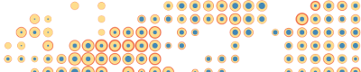
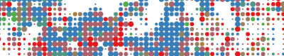
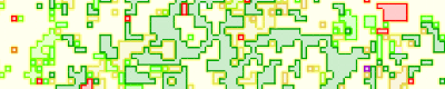
Shape/Color/Size Style

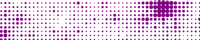
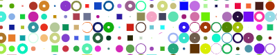
This style is a generic style which allows to define the shape, color and size of each grid cell, independantly according to 3 different variables. Three shapes are currently available: square, circle, triangle (up, down, left or right) and donut (a disk with a hole of changing size). To show grid cells as small squares with only changing color, one of the styles based on web GL here or here should rather be used, for efficiency reasons.
- See this example with changing size (code).
- See this example with changing size and color (code).
- See this example with random shape, color and size (code).
Square color WebGL Style
This style displays each cell as a square, with a changing color. This style uses webGL and should thus be used to display grid cells at detailed resolutions.
- See this basic example (code).
- See this example with dark style (code).
Square color category WebGL style
This style displays each cell as a square, with a changing color based on a categorical variable. This style uses webGL and should thus be used to display grid cells at detailed resolutions.
- See this basic example (code).
Composition style
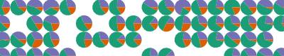
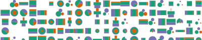
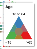
This style shows a composition at cell level in various different ways: Flags, pie charts, rings, segments, radar, age pyramid and halftone.
- See this basic example (code).
Segment style
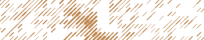
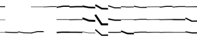
This style displays each cell as a segment with a changeable color, length, width and orientation.
- See this basic example (code).
- See this example with random segment orientation, color, length and width (code).
Stroke style
This style shows the stroke of each cell with different colors, widths, shapes and sizes. This style can be used in addition to others to show the cell strokes on top of those other styles.
Advanced styles
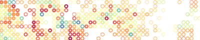
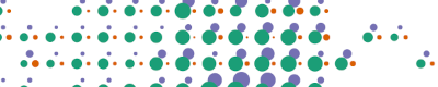
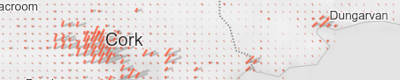
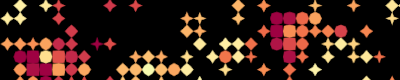
Dot density style
This style displays each cell as randomly located points, with changeable density and color.
- See this basic example (code).
- See this example with random colors (code).
Pillars style
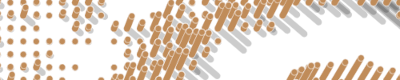
This style shows the grid cells as 3D pillars or, with changeable height, width and color.
- See this basic example (code).
- See this basic example with simple style (code).
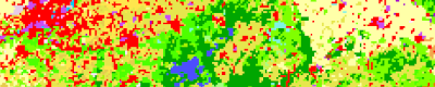
Ternary style
Ternary maps use color to show a composition according to three categories. Three different color hue are defined, that correspond to each of the three categories. The cells color is then selected according to the relative importance of the three categories. When two of the three categories are more important that the third, a color mix is used. A central class may be defined to show cases where the three categories are relativelly well balanced.
- See this example (code).
- See this other example (code).
Note that this style is not really a new style - it relies on a specific classifier.
Text style
This style shows the grid cells as text labels. The text, its color and font size can be set according to some cell values.
- See this basic example (code).
- See this example (code).
Image style
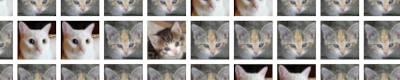
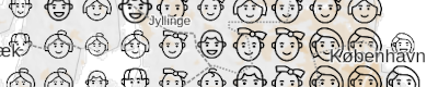
This style shows the grid cells as an image. The image and its size can be set according to some cell values.
- See this basic example (code).
- See this example, with Chernoff faces (code).
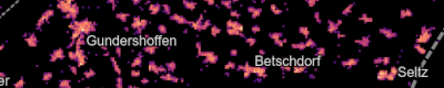
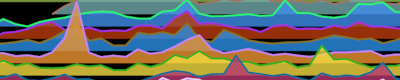
Time series style
This style shows the grid cells as a time series chart. It is particulary suitable to show data that has high temporal granularity and low geographical granurality (variation across time rather than space). The time series charts can be colored and sized according to other variables.
- See this basic example (code).
Side styles
The side styles are special:They do not display the cells, but their sides. They can be used to show discontinuities between cell values with, for example, some shadow effect.
Side style
This style displays the sides of the cells as segments with different colors and widths, depending on the values of the 2 adjacent cells.
- See this example (code).
Side category style
This style displays the sides of the cells as segments with different colors depending on the categories of the 2 adjacent cells.
- See this example (code).
Contour style
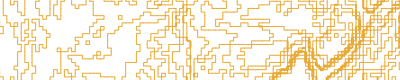
This style displays the sides of the cells depending on discontinuities between the 2 adjacent cells, like contour lines. For this style, the Tanaka style is simply reused with the same color for all lines.
- See this example (code).
Isometric fence style
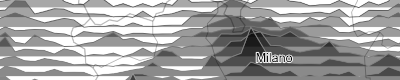
This style shows the composition of a total quantity into categories as vertical cross-sections oriented toward North-South and East-West. It is an alternative to composition style. It may also be seen as a bi-directional joyplot style showing categories - note that when angle value is set to 90°, the style is equivalent to a joyplot. This style was inspired by the USGS geologic isometric fence diagrams (1953).
- See this example (code).
Esthetic styles
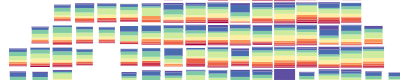
JoyPlot Style
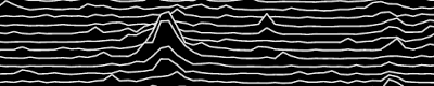
This style shows cell rows in the form of a ‘joyplot’ - named after Joy Division’s “Unknown Pleasures” album cover. For joyplot style showing composition by categories, or for various orientations and perspective angles, see isometric fence style.
- See this basic example (code).
- See this an example of shaded joyplot (code).
- See this an example with random colors (code).
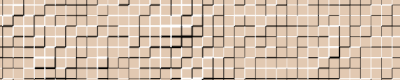
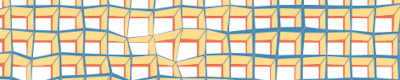
Mosaic style

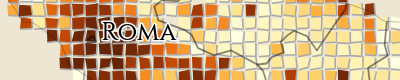
This style shows the cell as pseudo-irregular square shapes giving a mosaic effect. The cells are colored depending on a variable.
- See this basic example (code).
- See this roman style example (code).
Ninja star style
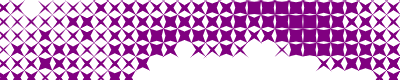
This style shows the cell as a star polygon whose compacity depends on a variable. The higher the value, the more compact the star: Maximum values correspond to a square, and minimum values correspond to a thin star. The shapes in between correspond to 4 branches stars looking like a ninja star.
- See this basic example (code).
- See this other example (code) with stars parallel to the x/y axes.
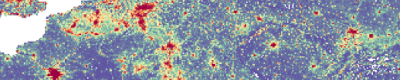
Tanaka style
This style shows the grid cells in a Tanaka style, that is with discrete colors and a shadow effect.
- See this example (code).
Lego style
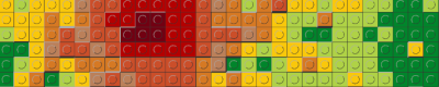
This style shows the grid cells as lego bricks with changeable colors and height based on a quantitative variable.
- See this example (code).
Lego category style
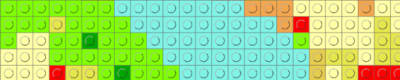
This style shows the grid cells as lego bricks with changeable colors based on a categorical variable.
- See this example (code).
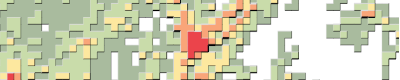
Kernel smoothing
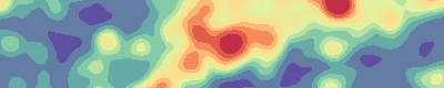
This style allows applying a gaussian kernel smoothing to the input grid. Other styles can then be used on the smoothed grid - this style is thus more a ‘filter’ than a proper style.
Note that this style is available within the gridviz-smoothing extension which need to be added as: <script src="https://cdn.jsdelivr.net/npm/gridviz-smoothing"></script>.
- See this elementary example (code).
- See this example (code).
The kernel smoothing computation relies on the fast-kde library, which produces smoothing approximation very fast. Note that the approximation degrades significantly for weak smoothing (for low sigma values).
Custom styles
The style can be freely defined through the drawFun, which specifies how to draw the list of cells within the view on the map canvas.
- See this example (code) to define a simple style to draw each cell as an arrow symbol.
Background layer
Background image layers may be defined:
- as a tiled layer: See this example (code) or this other example (code).
- or from a OGC WMS - Web Map Service: See this example (code).
- or as a single image file: See this example (code).
Foreground information
Foreground layers may be defined such as:
- label layers: See this example (code) or this other example (code).
- boundaries layers: See this example (code).
- points layers: See this example (code).
Transparency
To handle layer and style transparency, blending modes and alpha values may be defined at layer or style level. These values may be set according to the zoom level.
- See this example (code).
Tooltip
A tooltip may be customised for the grid cells passed over the mouse pointer. By default, the list of properties is shown.
- See this example (code) to define the tooltip text.
Buttons
To show zoom and full screen mode buttons, see this example (code).
View scale
For some predefined style parameters, viewscale parameter allows defining styling parameters based on the cells within the map view only. This parameter is an object computed only once from the cells within the view. It may be used for example to compute the minimum and maximum values of these cells and adapt a color scale to this for a better contrast. It should generally be used to compute scales that are view dependant - hence the name viewscale.
- See this basic example (code).
- See this more advanced example (code) using some predefined function.
Stretching
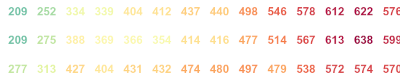
Most of Gridviz styles rely on a continuous mapping from a statistical variable to a visual variable (color, size, etc.). The statistical distribution can be stretched with one of the stretching functions listed below can be used. These are continuous bijective functions defined from [0,1] to [0,1] intervals. They have different properties and should be chosen according to the data distribution. The amplitude of the stretching can be adjusted with a parameter.
| Stretching function | Description | Stretching parameter |
|---|---|---|
| powerScale | Polynomial function | Power exponent, from 0 to Infinity. No change: 1 |
| powerInverseScale | Polynomial inverse function | Power exponent, from 0 to Infinity. No change: 1 |
| logarithmicScale | Exponential function | Logarithmic base, from -Infinity to Infinity. No change: 0 |
| exponentialScale | Exponential | Logarithmic base, from -Infinity to Infinity. No change: 0 |
| circularScale | Circular | 0: no stretching. 1: perfect circle section |
| circularInverseScale | Circular | 0: no stretching. 1: perfect circle section |
For more information on these functions and an overview of how they differ, see:
- this basic example (code).
- this other example based on webGL style (code).
- the code
- those graphs
Legends
Gridviz offers several types of legends that are suited to different cartographic styles.
The legend elements are added within a default HTML element. To define where the legend elements should be added, see this example (code).
Each legend can be customised using the ‘D3-like’ style() function after constructing the legend, like so:
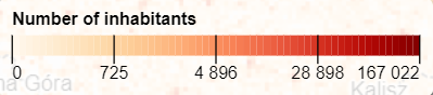
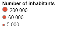
new gridviz.SizeLegend({
    title: 'Number of inhabitants',
    exaggerationFactor: 0.8,
    shape: 'circle',
    fillColor: '#3E5791',
}).style('padding', '0px 5px')
Color legend
- See this example (code).
- See this example (code) for a view scale based style.
- See this example (code) for a legend with static text.
- See this example (code) for a legend with diverging color ramp.
Color discrete legend
- See this example (code).
- See this example (code) for a view scale based style.
- See this example (code) for a quantile view scale based style.
Color category legend
- See this example (code).
Orientation legend
- See this example (code).
Size legend
- See this example (code).
- See this example (code) for a discrete style.
- See this example (code) for a view scale based style.
- See this example (code) for a quantile view scale based style.
Width legend
- See this example (code).
- See this example (code) for a discrete style.
- See this example (code) for a view scale based style.
- See this example (code) for a quantile view scale based style.
Ternary color legend
- See this example (code).
Leaflet
Gridviz can be used with leaflet by using the leaflet-gridviz plugin
Limit panning and zooming
See this example (code) to limit the panning and zooming to some limit values, in order to prevent the user to move toward undesired positions and zoom levels. Note that the panning limit applies to the map center, not the map borders. The panning limit is specified as an array [xMin, yMin, xMax, yMax].
Mixed resolution grids
A mixed-resolution grid is a grid which contains cells with different sizes.
- See this example (code).
- See this other example (code).
Note that most pre-defined styles of GridViz may not apply for mixed-resolution grids. Custom styles can be defined.
Alright?
Anything unclear or missing? Feel free to ask !